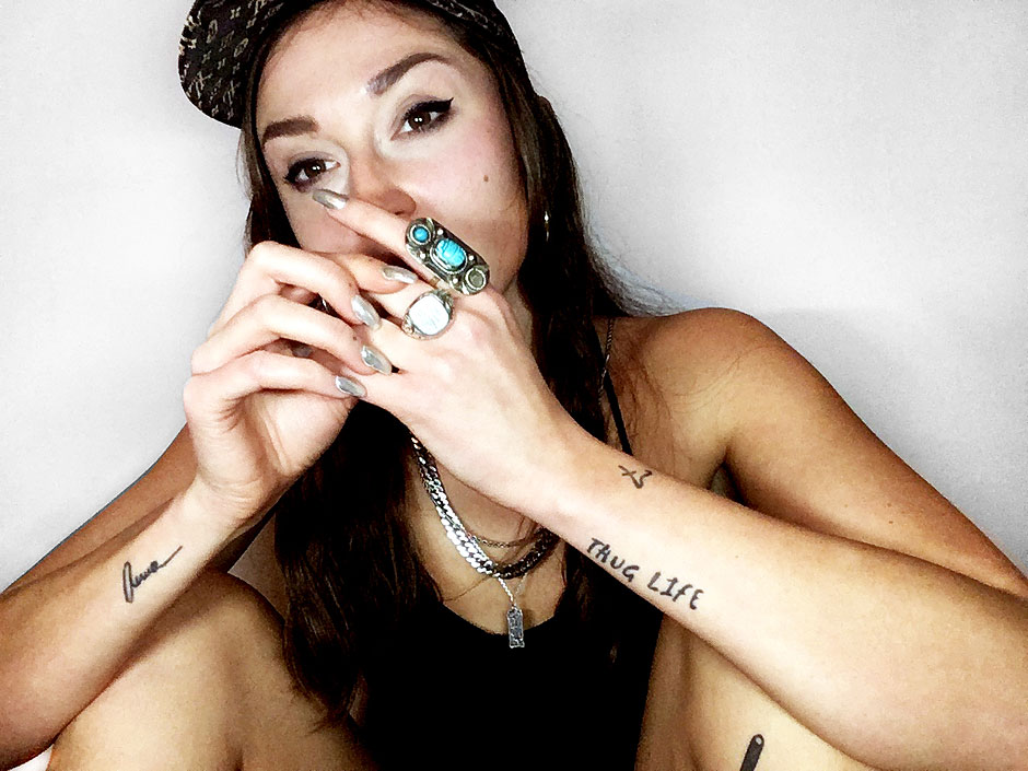
Hi Jana, you’re a freelance designer specializing in typography, lettering, illustration, calligraphy, and type design. How did you come to your love of letters?
I’ve always drawn and been creative, but it really started in college when, in order to have a change from the computer design stuff, I took a calligraphy course. The art of handwriting grabbed me and has not let go.
Your artist name is XULI. How did you come to this name?
Actually, the name doesn’t have an exciting story. When I did not want to use my real name on Facebook Xuli was, for whatever reason, the first thing that came to mind. And then it somehow established itself.
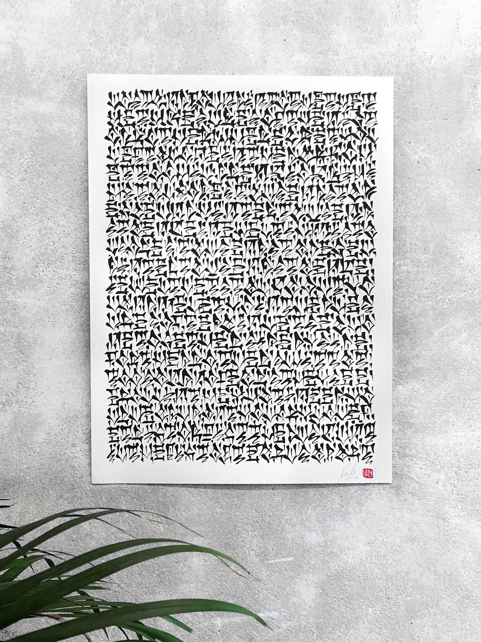
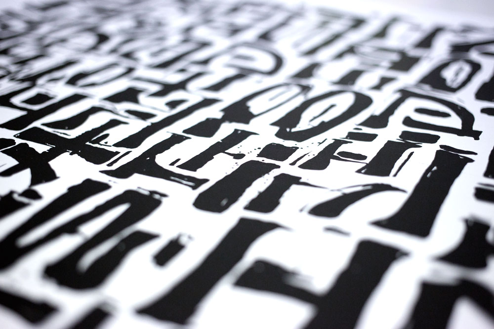
Your graphic works have a tremendously strong impact. Special styles also influence your work. Are these characteristic elements inspired, among other things, by Pixação?
Among other things, yeah. I would mainly call South American and Asian writing culture as my main inspiration. But I make many forms and characteristics subconsciously. I am impressed by everything that radiates power, energy, and emotion or that tells a story.
You also like to work with different artists. Are these collaborations an asset for you? Which have made a special impression on you?
When I see that someone is driving the same thought as me, so when I feel what they are making, I’m open to collaborating. The first artist I can think of who fascinated me was Fabian Wolf from Hamburg. I discovered his work at that time at a university annual exhibition and was blown away.
In your client portfolio you will find well-known companies such as adidas Originals or Lufthansa. How did you come to these collaborations?
As it usually happens, someone knows someone who knows you and then there it is. Lufthansa was, for example, through the collaboration with the guys from Salt & Silver for which I made the maps and typography for the books last year.
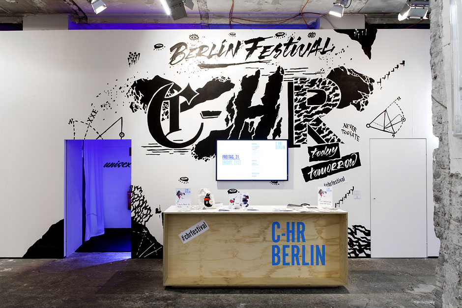
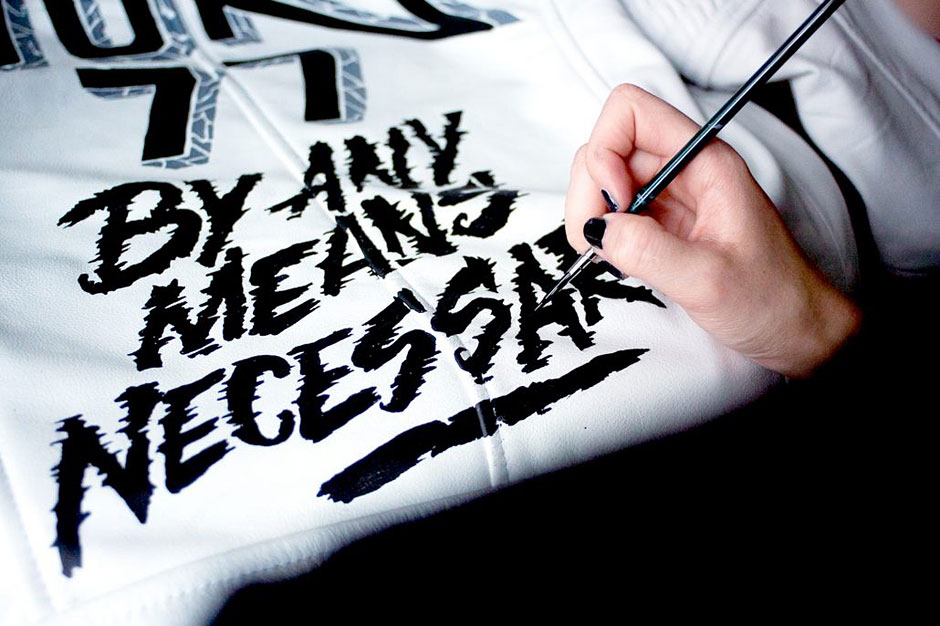
Your works are extremely diverse. From drawings on paper to large-scale murals. What are your tools for these works? Or do you have special tricks for certain graphical effects?
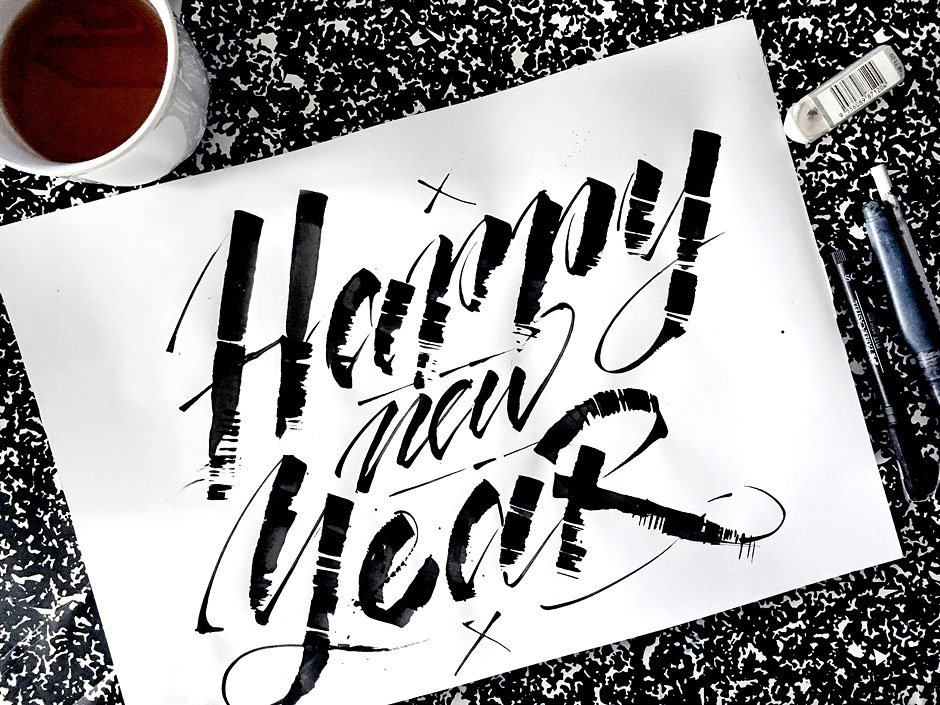
For certain things I have my favorite tools, but basically one must always estimate what is appropriate for which job, what background, what mood is to be transferred, what effects should be achieved? It is all then dependent on that.
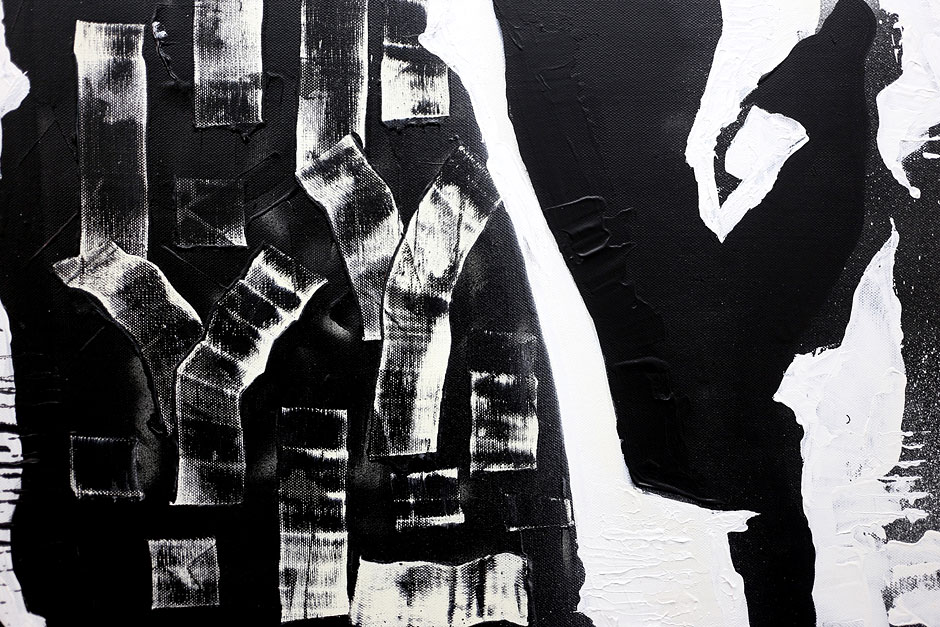
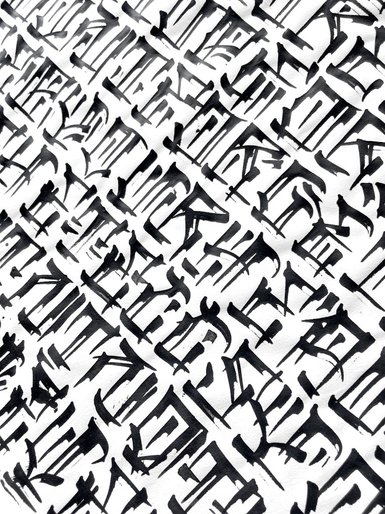
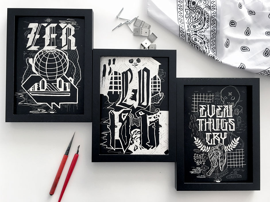
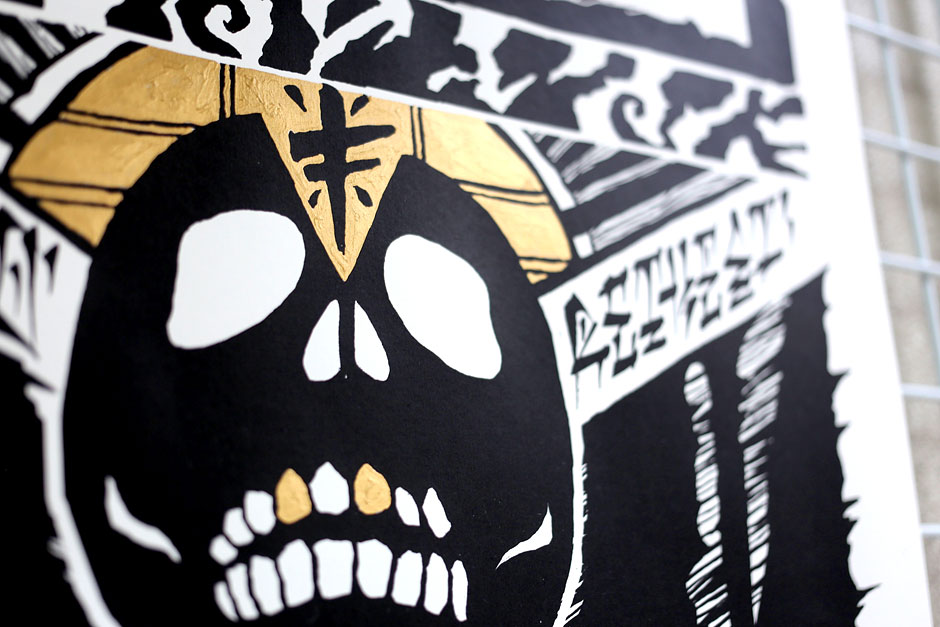
I work a lot with black-and-white, and use color more to set accents. Other than that I would say patterns, structures, contrasts, and layers are my weaknesses.
How do you digitize your illustrations? Do you have a specific workflow for your artistic work?
It mostly starts analog with a sheet of paper and a pen and then it is written on it so long as I think that I have enough successful elements which I can use. Then it is scanned and corrected on the computer, and finalized. Except of course with canvases and original artwork.
What would you tell a beginner who wants to enter the world of typography?
Buy a block and some writing utensils that you like and write your favorite song lyrics. If after the 4 times the ambition grabs a letter or a word just as you imagine it and you can not stop until you have done it, then you have made the first steps.
You are one of the few women whose works have been exhibited at the Calligraffiti Ambassadors. Why is that? Are there many women, especially in the field hand lettering?
This is a good question, I think there are as many women as men who do calligraphy and hand lettering, but they do not go as public, I would imagine. But there is an increasing number, and that pleases me. Whenever I get messages from girls who tell me that they want to start and ask me something about this then I will gladly help wherever I can. Be brave!
What trends can you observe in the typography scene? Can you inspire yourself with it in your own style?
One thing is already noticeable often seen at the moment is Gothic script and all possible variations and modifications of it, but frankly I do not really look at the trends, and if they influence me it’s more subconscious. Since I work a lot with feathers and ink, Gothic script is an exciting story and comes in handy. ☺
Which product would you like to put your personal stamp on or with whom would you like to work together?
A product I know of would be musicians for whom I would like to make an album artwork or logo. Two artists with whom I would, rather ideally, like to work together are Chaz Bojorquez and Mike Giant. There are many artists who interest me in LA. We’ll see what happens in 2017, you may be curious.
Where can you follow your work? Where can you find you in addition to your web site?
On Facebook and Instagram you can find a regular updates of my work.
Thank you for sharing your views with us.
Never miss a Free Font
Enter your email to get FREE blog updates and exclusive free fonts ONLY for subscribers!