Where are you from? What’s your job?
My name is Eric Lobdell. I’m working and living in San Francisco, but I’m originally from Colorado. I was a UX designer at Google until recently; now I’m on “summer vacation.”
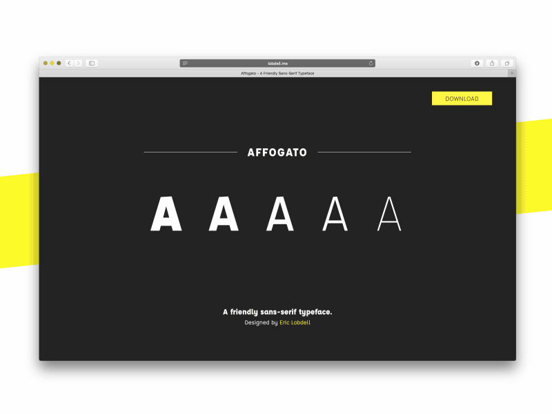
Currently you released the typeface Affogato. It looks fantastic! Can you tell me, how you created this font and what affected your work?
It all started in 2012, with this tweet:
The typeface I’m making will be an all-caps inline mash up of Neutraface and Gotham. And it’s coming along nicely! pic.twitter.com/GK1b13hH
— Eric Lobdell (@selamefekili) 16. August 2012
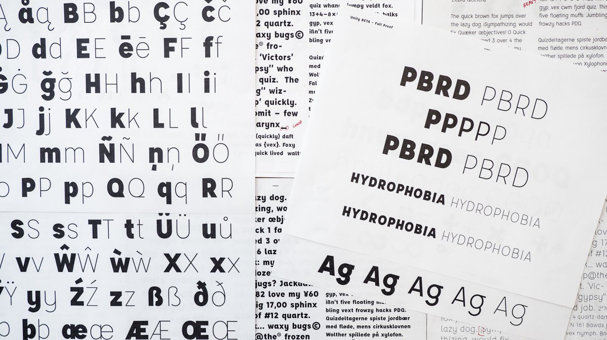
I was super pumped-up after attending an AIGA conference and wanted to make an inline hybrid of Neutraface and Gotham. As I mentioned in this story, Tyler Finck was a huge inspiration for my work. He is a fellow type designer that I found on twitter ~6 years ago. I began by drawing, then moved to illustrator to create all of my original glyphs. Eventually I switched to solely using Glyphs App.
Do you have a mentor or help with your first font creation?
Yes totally! After I had manually created four separate weights of Affogato, I reached out to James Edmondson. He met with me in person multiple times over the course of 4 months, to help me refine this typeface.
Affogato – A friendly sans-serif typeface by Eric Lobdell.
Before you start with fonts you created Apps for smartphones. When did you become interested in digital type design?
There was this pretty pivotal moment in my career when I deleted my entire stolen font library, and decided to only use the type I could afford. As a college student, that wasn’t much. I’ve always been obsessed with fonts and I figured they were a lot of hard work. I just had no real understanding of how hard, exactly.
I made this typeface free because I wanted to give back to the young designers out there that are hungry for quality typefaces, but can’t yet afford the licenses of some of the more reputable type foundries.
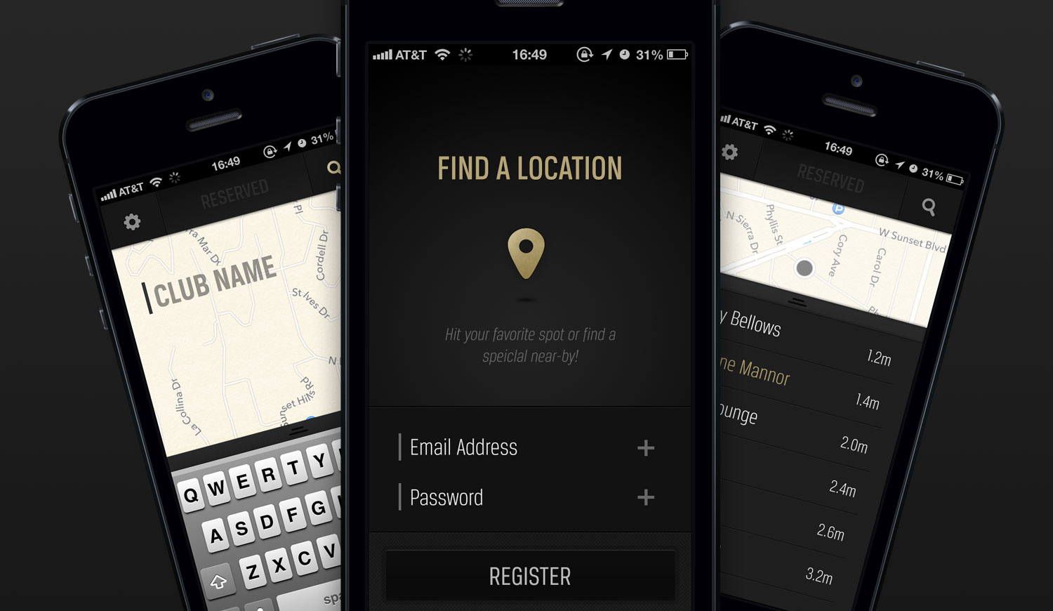
How important is typography for smartphone apps? Is that one of the criteria for a good usability?
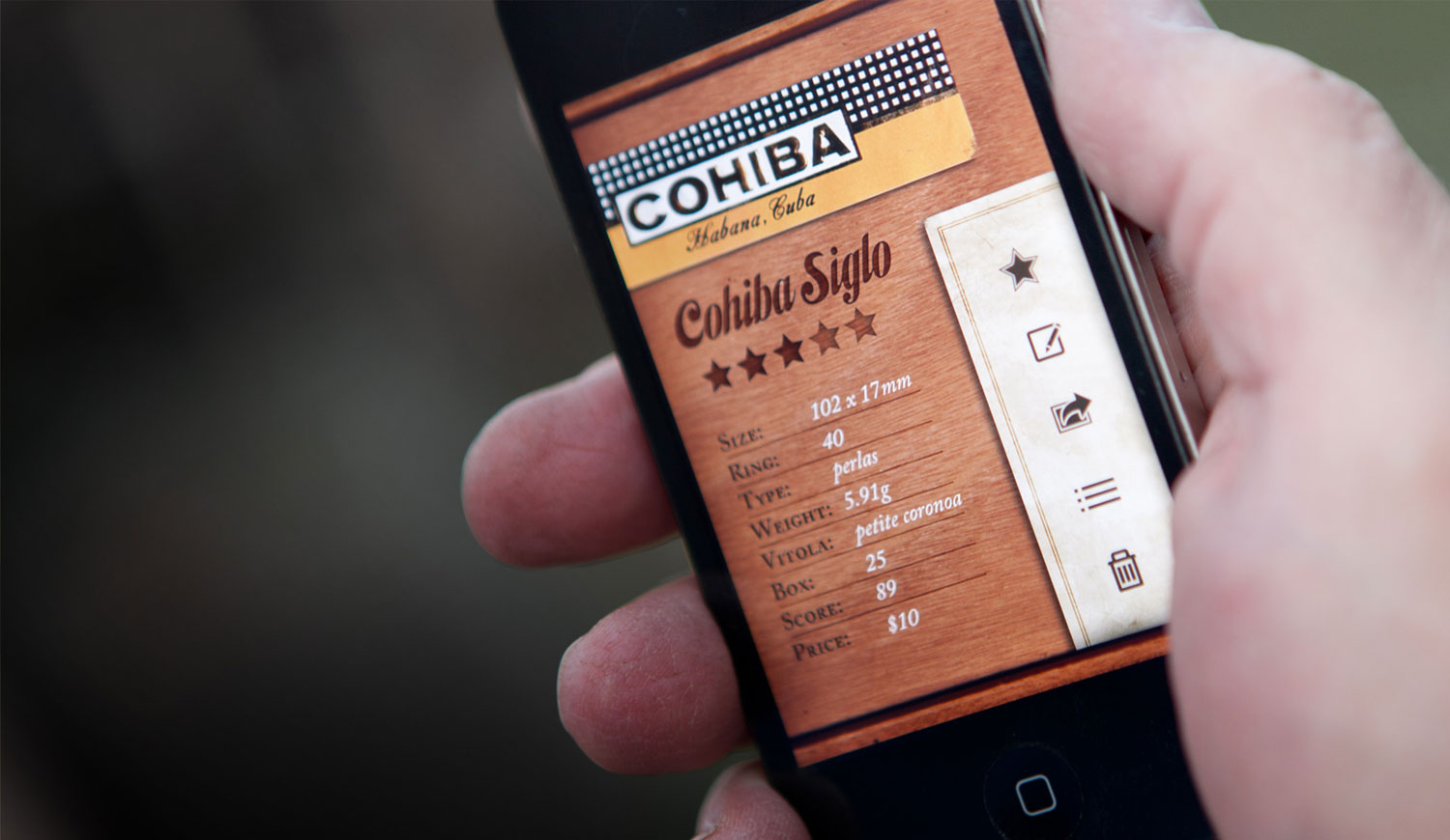
I’d say it’s absolutely critical. I remember in 2011 designing an app for cigar enthusiasts called Cigar Aficionado. The type was so important because of the rich visual culture engrained in the design of cigar bands and boxes. I chose to use Habano from Sudtipos foundry.
For type usability in apps, I look for typefaces that set especially well at small sizes — 8 and 10 point sometimes — to ensure that I don’t run into issues when considering a wide range of device resolution. I also like to make sure that the typefaces I choose offer multiple weights, so that I can avoid being cramped when establishing type hierarchies.
Where do you work? In a Studio space, Home office or Co-working?
Currently you can find me working out of various coffee shops and from my home office (aka my couch). A small piece of advice: don’t ever buy a white couch and then use it as your work chair. It won’t be white for very long.
Can you name some of your inspirations?
Definitely: DIN, Neutraface, Gotham, Proxima Nova, and Cyclone..
Do you have any tips for digital typography beginners?
Take some time to really learn the basics of the type design software you choose. I spent months making each weight of Affogato by hand, before I learned that once you make the Light weight and the Black weight, the computer can generate everything in-between automatically.
Before you finish, start thinking about how you’re going to get people to look at it. How you’re going to “release” your hard work. When I finished Affogato, I had no idea what to do next. The measly 200 twitter followers I had simply wasn’t enough. I couldn’t get a response from Lost Type Co. so I made an entire micro-site for it. I officially wound up “self-publishing” — which means I inevitably needed to self-promote it as well.
I wrote a blog about it, and that seemed to really get people interested in the story behind my work. I also submitted it to 100s of really small freebie websites hoping that some of the bigger ones would take notice. I’m still trying my best to get people’s eyes on it.
What are you working on at the moment? A new type design project?
Currently my main focus is finding a new job! I think after finishing V1 of Affogato I realized that it’s time to start making money again, and to focus on different kinds of problems.
I’ll also begin Affogato V1.5 with italics, math symbols, more language support, and an inline version of the Black weight. Unsure how soon I’ll do that though, it’s nice to be done with this for a minute.
What are you most proud of so far in your life and what are your future prospects?
Tough question, really. I’m most proud of this typeface at the moment. In general, in life, I think I’m proud of my ability to explore new passions, like type design, with as much enthusiasm and persistence as I do. I’ve always been keen on finishing my personal projects, and I think that’s something that I’ve worked hard to be able to say I do consistently.
In the future, who knows. Maybe this type design will open up new opportunities. Maybe it won’t. I’ll see where my curiosities take me!
Thank you for sharing your views with us.
Never miss a Free Font
Enter your email to get FREE blog updates and exclusive free fonts ONLY for subscribers!