Stefan Willerstorfer was born in Vienna in 1979 and studied design in Austria, in the Netherlands and in England. In The Hague (NL), at the Royal Academy of Art, he completed the Type Design course »Type and Media« with a Master of Design degree. At the University of Reading (UK) he completed the course in Information Design with a Master of Arts degree. Today, the FreeTypography Blog conducted the interview with Stefan Willerstorfer about his fantastic works and his love about typography.
FreeTypography [FT]: Stefan, you just recently released your second type family, Sindelar, at Willerstorfer Font Foundry. Congratulations! Before talking about Sindelar and your first type family, Acorde, I’d be interested to know how you came up with the idea of specialising in type design.
Stefan Willerstorfer [SW]: Thank you. My interest in type and typography emerged during my first year of studying at the Graphische, a graphic design school in Vienna in 1999. I had a strong interest in getting to know more about letters and started with trying to recognise typefaces.
FT: What was the first typeface you were able to recognise?
SW: I guess Gill Sans. From then on I continued with recognising typefaces. It’s always exciting when going to places where you haven’t been before to get a view of the typefaces in use. These can vary a lot between countries.
FT: Time has passed and now you are a successful type designer. What was your motivation for starting your own foundry?
SW: I started it in order to have the freedom to publish the typefaces I want to and to release them to the extent I consider best. There are no constraints or deadlines from outside. But with this freedom also comes responsibility. Running your own foundry means that you have to be organised, focused and versatile.
FT: What does the freedom of working independently mean to you?
SW: A lot. You can work on a typeface probably anywhere in the world at any given time even without a client giving you an assignment. That makes type design special in the area of graphic design. But the freedom to develop something no one has asked for also means that you cannot predict whether that product will get the interest you were hoping for.
The missing communication and feedback of a commissioned project can make the development a rather private and solitary one. I deal with the missing briefing from outside by defining specifications for the projects by myself.
FT: How do you define these specifications? What were the ones for Acorde and Sindelar?
SW: I developed Acorde with the aim of creating a typeface that can be used in all different sizes, from small continuous text to large headlines. Its main focus on corporate designs is also reflected by its name: Acorde stands for ‘a’ ‘cor’porate ‘de’sign typeface. The advantage of fonts that can be used for all sizes is that it’s always the correct font being used. Since a typeface for corporate designs is not only used by professionals but also by lay people this can be an important quality.

Various styles of Acorde. This sample gives a good overview of Acorde’s diversity. Characterful in big sizes, decent and reliable in small sizes.
Sindelar was developed to be the perfect text face choice for newspapers and magazines. I knew from the beginning that it had to be robust, economic (i.e. space saving) and highly legible in small sizes. In both cases the application purposes lead to certain qualities the respective typeface should have.
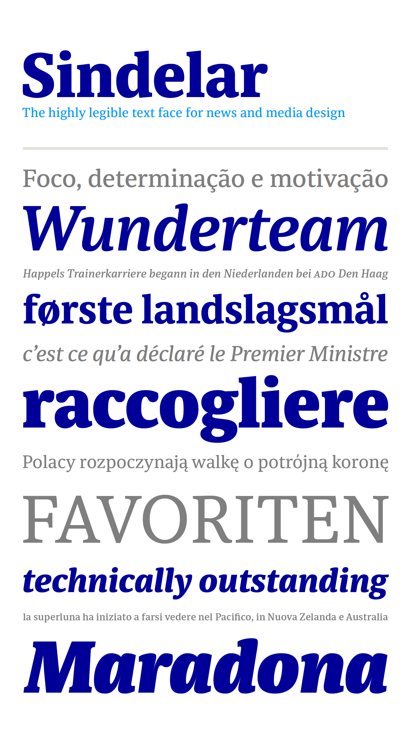
Various styles of Sindelar. This sample gives a good overview of Sindelar’s qualities. Although optimised for small sizes, Sindelar’s low contrast and robust serifs give the typeface a strong impact and an unmistakable personality in larger sizes.
FT: These main application purposes you have mentioned, why did you choose exactly these fields?
SW: I decided to develop typefaces for these areas since I had a lot of experience with them. Directly after studying graphic design a fellow graduate and I ran a studio in Vienna with a corporate design focus. This experience was very valuable for the development of Acorde.
The intention to design a typeface for newspapers and magazines came at the time I was working at the studio of international newspaper designer Rolf Rehe. The idea of creating three different Regular weights that differ in weight only slightly (Regular A, B, and C) came also from that experience.

Sindelar comes in nine weights in Roman and Italic each. Three of these weights are grades of Regular that differ in weight only slightly.
FT: Do Acorde and Sindelar work well together?
SW: I developed Acorde and Sindelar independent from one another. They have specific purposes and therefore decisions had to be made differently. But they have some qualities and similarities in common. That’s why they work very well in combination.
FT: What does the name Sindelar stand for?
SW: Sindelar is named after famous Austrian football (soccer) player Matthias Sindelar (1903–1939), one of the best players of his time. Both share two major qualities with one another: their technical brilliance and their way of performing aesthetically to the last detail. The football player’s nickname »Der Papierene« (the Paper-man) elegantly refers to the media too.
FT: Bespoke typefaces have become more popular in recent times. What do you think about this development?
SW: I fully understand companies who want a type family exclusively designed for their own use. A bespoke typeface fully suits the need of a company and can help the company to distinguish its voice from those of its competitors on the market.
FT: Do you also develop individual lettering for logotypes?
SW: Yes, that’s something I really enjoy. Compared to a whole typeface where every letter has to work in all combinations, a logotype gives you the freedom to design the letters specifically suited to the exact context.
FT: In contrast to a logotype, for a type family you have to draw all letters. What letters do you start the design process with?
SW: That can differ from project to project. Sometimes you have an idea for a specific letter or a way of dealing with a certain detail and build up the design process from there. Also the weight you start with can differ. With Acorde and Sindelar both being text faces, it was logical to start with the Regular weight.
FT: Are there any glyphs you like to design most? Do you prefer to design serif or sans serif typefaces?
SW: Some glyphs are more interesting than others since they define more of the typeface’s overall character and contain specific details. Interesting ones are the lowercase a, e, and g or uppercase letters such as J, Q, R, and S. Figures are very interesting, too.
I like serifs and sans serifs and don’t consider one of them as more difficult than the other. The design process of both offers specific challenges.
FT: What styles of a family do you prefer to design? Romans or Italics? Lighter or heavier weights?
SW: Every style has its own attractiveness and challenges. I really enjoy designing the very heavy weights, especially the heavy Italics.
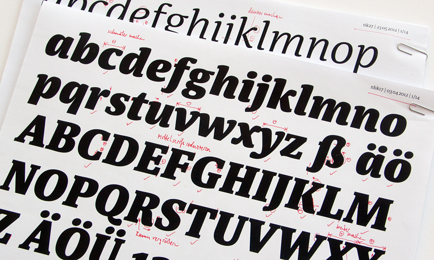
Corrections on a print of Sindelar Extrablack Italic, dating from April 2012, Vienna.
FT: What do you like about the heavy weights?
SW: I like them for various aspects. The darker the weight gets, the more obvious and distinguishing some details become. That gives me the possibility of considering decisions I made for the Regular weight in a different context. Usually this has an important influence on the Regular weight.
Designing a very heavy weight is also a great challenge since all the optical corrections are even more important than in all other weights. Especially for a sans serif such as Acorde with its low contrast.
FT: Do you start the design process with sketches or directly on screen? How important is the software you use?
SW: I prefer to start the design process on paper. Just on a sketching sheet within my reach when I have an idea for a certain letter shape. I have made enough sketches before I start to digitise the letters that I know the direction I’d like to head with the design.
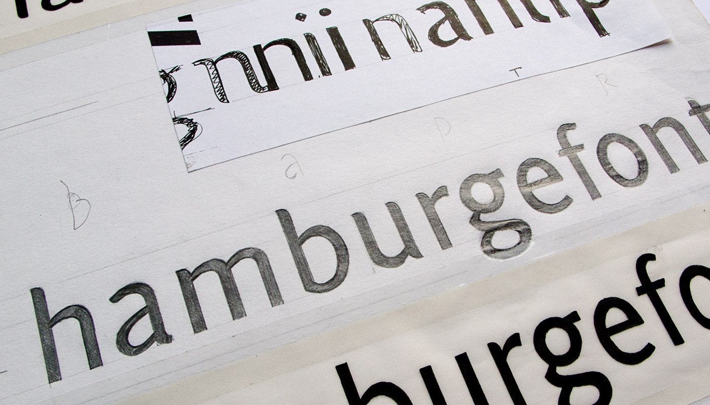
First sketches for Acorde, dating from January 2005, The Hague.
It’s important to have software you can rely on and which supports you with the design process. Good software can definitely speed up the development. Apart from that I don’t believe that it has a major influence on how the letters look.
FT: In comparison to other foundries your pricing is a bit higher. How did you come up with your pricing scheme?
SW: The pricing reflects the high quality and the amount of work to achieve that quality. It also emphasises how valuable a suitable typeface can be for a project, a product or the representation of a company. Keeping the prices above average also has the advantage that the typefaces are not overused but keep some exclusivity. I don’t agree with the trend of selling cheaper and cheaper. In the end it all sums up to the rule: “You get what you pay for.”
FT: How do you feel when you see your typefaces in action?
SW: There are two phases in the development of a type family I like most: The exciting phase of getting your ideas on paper and starting to digitise and the phase when the development is over and you see people using your typeface as an essential part of their projects. Both phases are a great motivation for the creation of future typefaces.
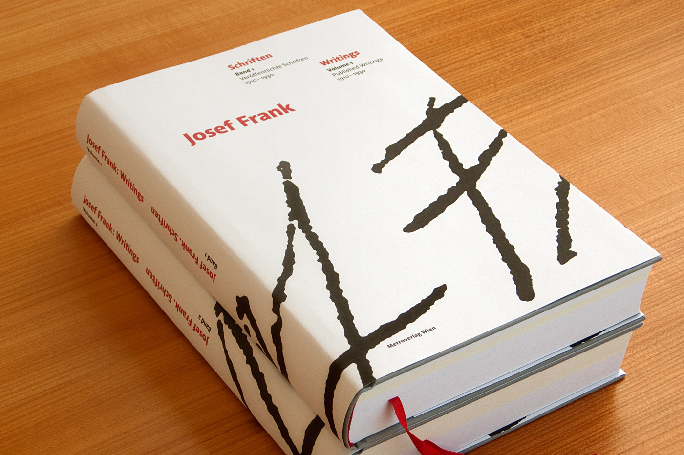
The bilingual book, »Josef Frank: Writings«, is a complete collection of all published writings of the Austrian architect Josef Frank. The two-volume book is entirely set in Acorde and was designed by Austrian book designer Peter Duniecki.

The German newspaper »INFO – Der Südfinder« is a regional newspaper in Baden-Württemberg with a circulation of more than half a million copies. Acorde is used for text as well as for headlines and demonstrates its ability to be a true workhorse. Design by Hans Peter Janisch.

Acorde is the headline typeface for the Austrian printing and design magazine »4c«.
FT: Is it important for you to be in contact with your customers?
SW: Yes, I really appreciate that. A typeface is a product that only comes to life when it is used. I am interested in hearing my customers’ feedback and in knowing about their needs. This kind of communication is valuable for clients and foundries alike. That’s why I prefer clients to purchase directly from my foundry’s website. Having no reseller in between, cutting off 50% also means that this amount can be invested in the extension of existing families or the creation of new ones.
FT: Do you share all the knowledge and experience you have gained with anyone?
SW: Yes, I have been teaching for six years now and I still enjoy it. Working on typefaces which is rather an isolated process where contemplation is needed and working with people are two very different activities and therefore a balanced combination. It is great not only to design but also to discuss design because you get a different view of things you usually take for granted, when you explain them.
FT: Where did you study?
SW: I studied in Austria, in the Netherlands and in the UK. Graphic Design at the Graphische in Vienna (the school I am now teaching at), Type Design in the »Type and Media« master course at the Royal Academy of Art (KABK) in The Hague and Information Design in the MA course at the University of Reading.
FT: How did you profit from your studies?
SW: The Graphische was the perfect base for developing my graphic design skills. It heightened my interest in typography and I got motivated to continue with my studies in The Hague and in Reading. Both master courses were really intense and I learned a lot in rather a short amount of time. That’s why I needed some more years after graduation to be finally capable of applying what I had learned to the full extent.
I am very grateful for the education I got at these various institutions. This gratitude was also a motivation for becoming a teacher.
FT: What kind of techniques do you recommend to people who want to start with type design?
SW: I really recommend calligraphy. At »Type and Media« we did a lot of writing with the broad nib pen and the pointed pen. This really opened my eyes for the different kinds of contrast these pens create, for the letters’ proportions, for the Roman and the Italic construction, and so on. As part of my classes I write with my students, too. I know from my own experience how much they learn from doing that.
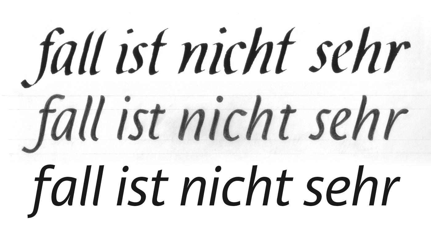
The development of Acorde Italic started with calligraphy. Writing with the broad nib pen (at the top), sketches based on the writing (middle), final version of Acorde Italic (bottom).
FT: Is there a book that had an influence in the process of practising your skills?
SW: One book was really important for me at the time I started with recognising typefaces: The FontBook by FontShop International helped me with honing my vision and getting to know more and more typefaces.
FT: What are you working on at the moment? A new type design project?
SW: Yes, the typeface I started to work on just recently is a typeface inspired by the qualities of a famous mountain range. Since my idea is to reflect the roughness and the bulkiness of the mountains I considered a very heavy weight as a much better starting point than the Regular weight. As I mentioned before, what style and letters to start with always depends on the project.
FT: That sounds interesting. I look forward to hearing more about it once it’s finished.
SW: I will keep you and your readers updated.
FT: Thank you for sharing your views with us.
SW: Thanks a lot, too. It was a pleasure.
Never miss a Free Font
Enter your email to get FREE blog updates and exclusive free fonts ONLY for subscribers!