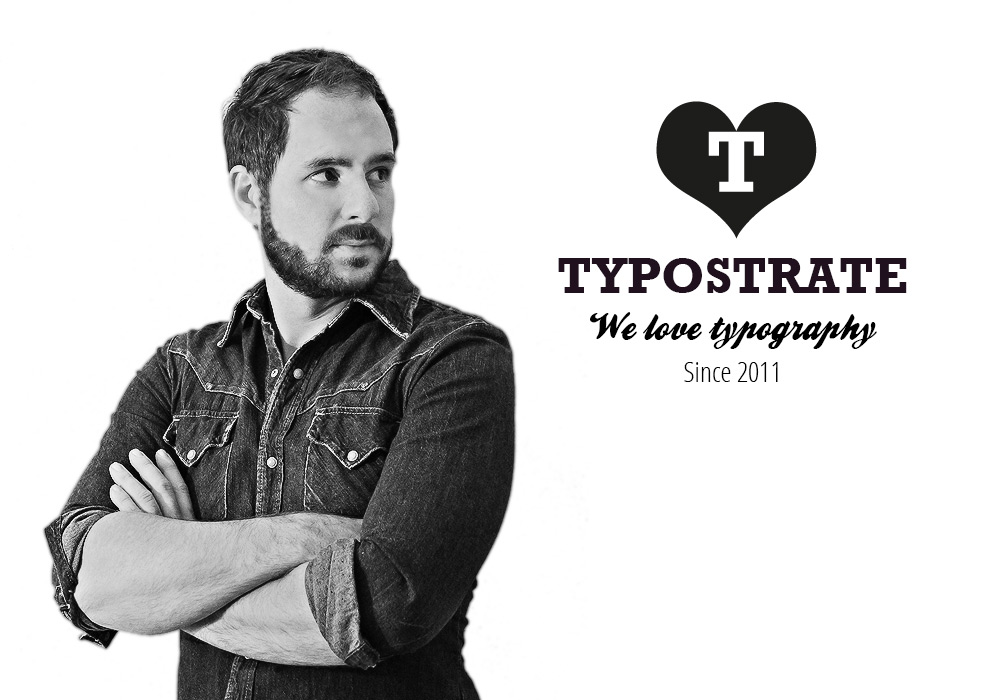
What is Typostrate and when did you start it? Who is your audience?
Typostrate is a modern site about contemporary Typography born with the idea of having a personal diary of modern artworks. We started with a small common tumblr blog 2011. While tumblr soon recognized our blog as one of the first tumblr typography blogs we were asked to join their category of typography on their platform. Done so, typostrate surprisingly went up in the air. This was the day to overthink the simple idea of having a diary, but having a platform for all the dessigners out there to enjoy the power and love of typography worldwide.
Who is behind Typostrate? Are you type designers?
Behind typostrate is my brother in law Michael, a self taught type enthusiast. And me – Chris, a studied designer within the fields of, graphic design, visual communication, fashion and art. I am not a real type designer, although I designed typefaces during my design studies.
How often you publish new topics on Typostrate? Do you also report about typography events?
We are publishing while we got something new and interesting jumping to our eyes or sent by our. In deed we once had a section called typography events, that was in 2014, but to run such a project there hast o be more than only one site showing some events. Maybe an own tool someday…
Where you find your great subjects for your blog?
Everywhere, but within these years we have found some very nice sources we don’t want to tell everybody. Its like asking Coca Cola what their secret ingredient is.
With your very inspirational Instagram account you build up a large follower-community. Does this now in competition with the blog?
Nothing what we do is in competition to our site, nor our blog or social media platform. We try to reach a larger audience through the social media channels, because the people are partioned today into diverse directions by different interests and trends. To have more people knowing your site, you have to follow these interests and trends.
In the past years type and typography have to grow in popularity. Do you see this trend on your blog, too?
We see a very important trend reaching germany at the moment with brushlettering. Indonesia and USA are big in this field of typography. Another trend to be aware of is sincerely calligraphy which is celebrated by the russian federation. Its astonishing that a classical gothic script could look so good on a wall while written by a contemporary typographer.
You are from Stuttgart, Germany. Do you think typography has a big influence of the public’s perception?
No I don’t think so. The eyes of the poeple are mostly directed to their cellphones. Some might see the little highlights between the many colours of the city but I think people are only recognizing typography while they got in touch with it somewhere or they were educated to do so.
Can you name some of your favorite inspirations and fonts?
My most favourite inspirations are mostly made by great designers always inventing theirself new like Seb Lester, Erik Marinovich and Jessica Hische, just to name some. My favourite fonts are mostly found on behance, where young talents try to put together some amazing glyphs like you can find in our free font section.
What you are planning for the future?
First of all we are planning to create more significant content and we like to continue connecting all designers and type lovers of the world – however this might look.
Never miss a Free Font
Enter your email to get FREE blog updates and exclusive free fonts ONLY for subscribers!
